Can I ask you a personal question?
How’s your relationship with colour these days?
Does your heart sing, or skip a beat, when you catch a glimpse of an unexpected colour combination? If it does; Hooray! Congratulations….I’m so happy for you!
Or are you in a bit of a rut, indecisive, feeling a little anxious or wishing you could just spice things up a little? If this sounds like you I might just be able to help.
On the surface colour is straightforward enough. Small children don’t worry about such things; for them it’s black and white. You have your favourite colour/s, and the colours that make you go ‘yuk’. Then, like with most things in life, as we grow up things just seem to get more and more complicated.
At school we learn that colour is a scientific phenomena. We are taught about Sir Issac Newton’s Theory of Colour based on the observation of white light refracted through a prism and separating into its component colors: red, orange, yellow, green, blue and violet.
In physics we learn that our whole universe is pulsating with electromagnetic radiation with frequencies that range between thousands of kilometres to a fraction of the size of an atomic nucleus – and we can only see the waves that are between 0.00038 and 0.00075mm.
That’s a miniscule section of the whole electromagnetic spectrum.
In biology we learn that the eye is lined with a thin layer called the retina and this hosts the photoreceptors known as rods and cones. It’s the cones that perceive colour and we have around 6 million of them
In art we learn about the hue circle, primary and secondary colours – and how to mix them.
At break time we learn that some colours are ‘cool’ (black – OK, not strictly a colour) and some colours should have stayed in the nursery. (bright green, orange and baby pink mostly)
Then we leave school and as we grow up other forces creep in and begin to shape our perceptions of colour and then, somehow, it’s no longer black and white.
So let’s first consider our sensory perception – we see colour. Right?
Well….yes. But it’s soooooo much more complicated than that.
Until recently our five senses were described by scientists and philosophers in isolation from each other but now neuroscientists believe that this is misleading and that all our ‘real life’ experiences, including how we experience colour, involve multisensory interactions.
Oh, and we don’t have just 5 senses – we have as many as 33 and these include equilibrioception (a sense of balance) kinaesthesia (a sense of movement) nociception (a sense of pain) thermoception (sensing the temperature around us) proprioception (that’s knowing where bits of your body are without looking) and chronoception (a sense of passing time).
I don’t think it’s on the official list but I’d like to add comoedoception – that’s having a sense of humour and the ability to not take yourself too seriously (I made that one up)
Then there are other, non-sensory influences.
These can be explicit or subliminal and include experiencing something as a social group, (rather than as an individual) and wanting to be ‘on trend’
The Pantone Colour Institute has an influential global reach and presents us annually with the Colour of the Year. If you work in the commercial design industry it’s essential that you are aware of these trends and timing is everything if you’re to be seen to have your finger on the pulse and ride the wave of a fashionable colour.
The creative industries are a powerful force and will use all means of manipulation and brainwashing to ensure you redecorate and replace your capsule wardrobe regularly. Ever wondered why you are suddenly drawn to a colour you’ve loathed in the past? That’s the colour institute doing their job.
Long spells in art school might also corrupt influence your approach to colour. Anyone familiar with the cannons of art academia may be scarred prejudiced by the subtext that colour is superficial/aesthetic/decorative – and not really a serious matter.
I’m guessing that for some of you reading this you are, like me, unconcerned by the fashion police, or this years ‘on trend’ colour – you simply want the freedom and confidence to enjoy working with colour. So for people like us there is really only one issue when it comes to colour, and that’s subjectivity.
Subjectivity is all about YOU – how you perceive colour, what you like, what this colour reminds you of and how it makes you feel.
For us the first rule of colour is: THERE ARE NO RULES!
OK – maybe just a few guidelines.
So – next time you are wrestling with colour – forget what the colour forecasters are saying, don’t worry about what other people might think, experiment with some new colour combinations and don’t ask yourself “How does this make me look?” ask your inner self “how does this make me feel?”
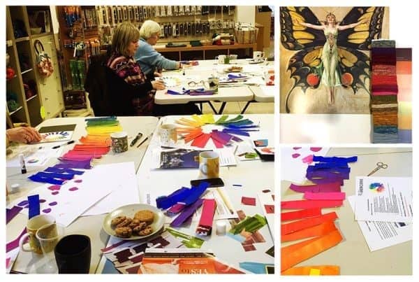
If you’d like to spend a day with me exploring colour and creating beautiful colour stories in a ‘hands on’ workshop you might like to join my Colour Workshop at Norfolk Yarn in June.
The day includes:
- ‘Hands on’ painting sessions enabling you to fully understand, and enjoy, the creation of a colour wheel.
- Demystifying colour terminology and the relationship between hues.
- How to generate exciting colour harmonies by following, and breaking, ‘the rules’
- Creating yarn combinations and unique colour palettes for your textile projects.
- Understanding the significance of proportion.
- Insights into the psychology and symbolism surrounding colour.
- A kick start into your own colour journaling.
I ran one recently and it was great fun, very productive and helped reignite everyone’s passion for colour.
If you can’t join me, but you feel like your relationship with colour needs a little attention, I have a rather fun little activity you might like to try. It’s designed to get you looking more closely, and thinking more subjectively, about colour – and it’s a great way to kick start your colour journaling.
So here we go……
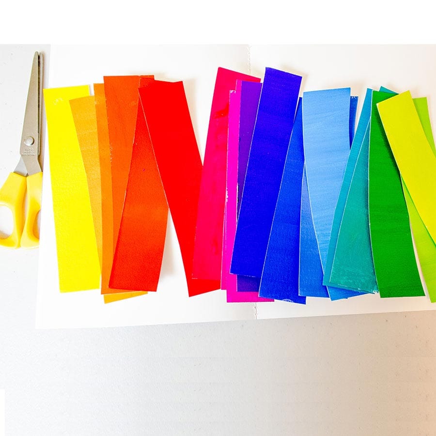
For every colour in the spectrum create a colour story board. That simply means make a collage of pictures that are mainly that colour. Try to use as many different variation of that colour as you can – don’t over think it, or ask yourself whether you ‘like’ or ‘dislike’ the colours. just stick them down.
Next, for each colour, simply list everything you associate with that colour. It might be food, an emotion, a landscape, a smell, a piece of clothing, a favourite auntie…..that’s it.
OK – I’ll get the ball rolling.
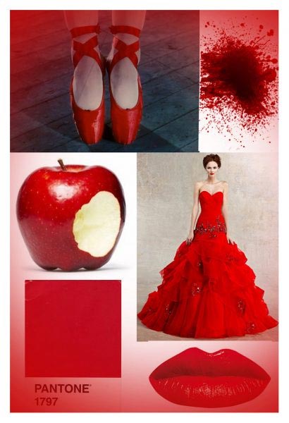
RED
Lipstick, blood, apples, tomatoes, anger, passion, bull fighters, nail varnish, Red Army, Red Cross, Red Tent, red shoes, red knickers, FIRE! STOP!
Phodophobia; is a fear of the colour red.
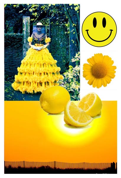
YELLOW
Sunshine, yellow ribbons, submarines, *smiley face, smiley face, sad face*, custard, egg yokes, baby chicks, scaredy cat…. jaundice…er, lets stop there.
Xanthophobia is a fear of the colour yellow.
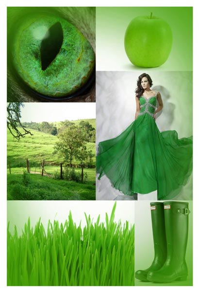
GREEN
GO! My favourite colour (as everyone under the age of 10 knows – you MUST have a favourite colour by which you will be judged) chlorophyll, new shoots, eco warriors, naive, green tea, jealousy, sea sick, green cross code, my favourite charity shop cardigan that I literally loved to pieces and couldn’t bear to get rid of, pool tables, the green green grass of home, Greensleeves, the dress they always put the red head in…..
Chlorophobia is a fear of the colour green
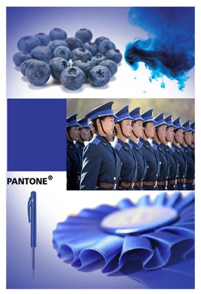
BLUE
Steady now… loyalty, precaution, my horrible school uniform, any uniform, big sky, oceans, blue moon, blue movies, big blue eyes, forget-me-nots, the blues, baby blues, black and blue, flashing lights and sirens, another uniform….ello, ello, ello….what’s giong on here then??
Cyanophobia is a fear of the colour blue
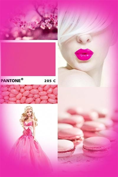
PINK
Sherbet, Brighton rock, fluffy mohair jumper (mine in 1982) ballerina’s, pink ribbons, in the pink…..OK. I’m bored with pink. And I can’t find a word for the fear of pink. Does that mean it’s the least scary colour??
By the end of this activity you may have rediscovered colours you’d forgotten about, found colours that make you happy, or simply reminded yourself that there’s a whole spectrum out there, pulsating with energy and waiting for you to dive in.
Enjoy!