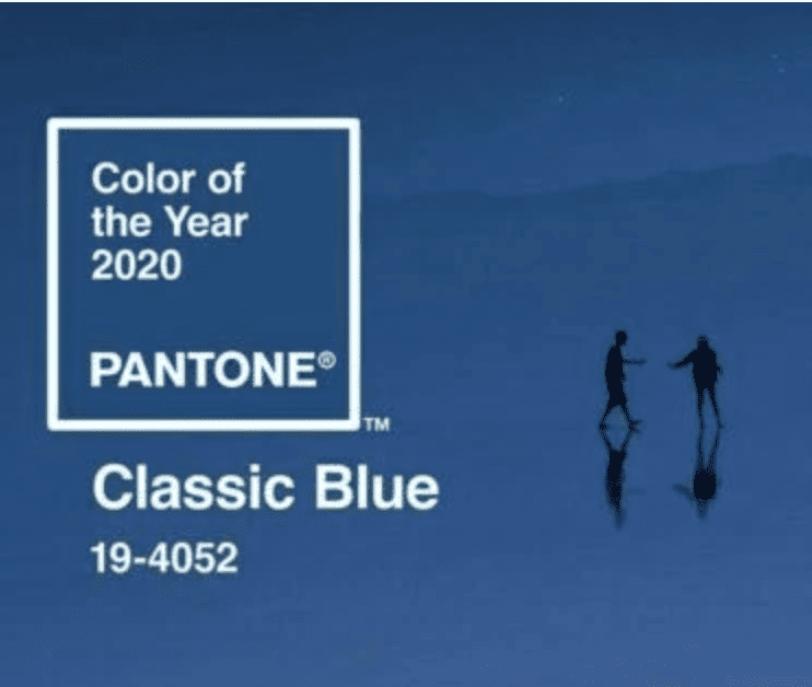
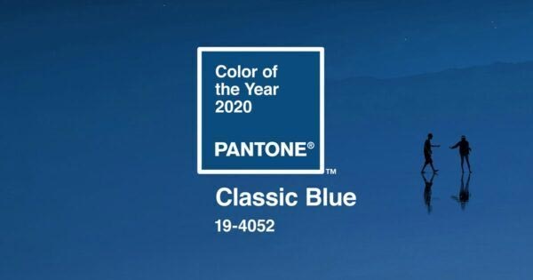
CLASSIC BLUE is Pantone’s 2020 Colour of the Year.
Blue is generally perceived as a sensible, grown up and conservative colour; a nice, normal, sensible colour. In fact a 2015 survey concluded that blue is the world’s most popular colour.
It’s so ubiquitous, and evocative, it’s difficult to imagine that once upon a time it was a colour with no name. In the hierarchy of colour names the concept of blue arrived fairly late in the day.
In most ancient languages dark and light were named first, followed by the ‘colour’ names: black, white, red, green yellow…. then blue. Colour etymology is as subjective as it’s symbolism; why would blue and indigo be named as different colours in Newtonian colour theory? Surely indigo is blue?
It seems that Isaac Newton liked scales of seven. Seven musical notes, seven days of the week – and the idea of an indigo neatly presented itself as the seventh colour. I’m not about to start an argument about colour with a dead scientist – but it does illustrate that if Newton says that indigo’s not blue, might we also easily be persuaded that black is white? The voice of authority can potentially change our perceptions of practically anything.
It’s thought that one of the reasons it took so long to find a name for blue is that it was such a tricky colour to make. Yes, it’s always been the colour of sea and sky, and a few pretty, flowery or mineral accents, but as a pigment historically it’s manufacturing process was prohibitively labour intensive.
The brightest blue pigments were unquestionably made from the mineral lapis lazuli which was first mined around 9 thousand years ago mainly in an area that’s now part of Afghanistan.
By the 6th and 7th century this brilliant mineral was being ground into powder and through a gruelling process of pounding, grinding, sieving and kneading with sticks, (how do you knead with sticks?) it was transformed into a pigment that became more valuable than gold and in it’s paint form was known as ‘ultramarine’.
Throughout the middle ages and the Renaissance period ultramarine was the most expensive, and most valued colour in the artists paint box reserved for special details such as the gowns of Angels, Jesus and the Virgin Mary.
In Titian’s work The Tribute Money Jesus wears ultramarine (eeek! That reminds me – I must do my tax return….) and Ariadne wears ultramarine as she’s descended upon by Bacchus and his inebriated entourage in Bacchus and Ariadne.
With the introduction of synthetic blue pigments in 1828 blue dyes and paints eventually became commonplace and it’s popularity now positions it as a colour no longer symbolic of heavenly bodies and mystics. Blue is now a ‘solid and dependable’ colour.
According to Laurie Pressman, the vice president of the Pantone Colour Institute, this years’ colour of the year was chosen to offer the reassurance and confidence that people are searching for in an unstable world, with an uncertain future.
Pantone’s official statement describes this colour as:
“A timeless and enduring hue elegant in it’s simplicity. Suggestive of the sky at dusk, the reassuring qualities of the thought provoking PANTONE 19-4052 Classic Blue highlight our desire for a dependable and stable foundation from which to build as we cross the threshold into a new era”
So our colour of the year, the one that’s heralding in a whole new decade, is a twilight colour designed to evoke the sky at dusk and according to Pressman “anticipates what’s going to happen next’ and asks “What’s the future going to bring as we move into the evening hours?”
I have nothing against this inoffensive, strong and stable colour. It’s just that I can’t help feeling the tone should be a little darker and the time a little later. If Pantone’s Colour of the Year is to represent the current global psyche perhaps it should be less new normal and acknowledge that we’re living in The New Abnormal.
And it’s still 2 minutes to midnight.
Happy New Year everyone!


This Post Has 0 Comments